
ecommerce Conversion

How to Improve Ecommerce Conversion Rate: 15 Proven Strategies to Increase Sales

Getting traffic to your ecommerce store is the problem most businesses solve first. Getting that traffic to buy is where most of them quietly lose revenue. If your store converts at 1–2%, you’re not failing β€” but 98 of every 100 visitors are still leaving without purchasing. This post covers 15 specific changes that move that number, organised by where in the buying journey the friction is actually happening.
User

Anal Panchal

eCommerce SEO

Jul 13, 2026

12 Min Read

Table of Contents

Quick Insights

Key Takeaways

The average ecommerce conversion rate is 1.4%. Most stores are losing revenue to fixable friction β€” not bad traffic.

47% of cart abandonments are caused by unexpected costs at checkout. Showing shipping fees upfront is one of the highest-leverage single changes available.

Requiring account creation before checkout drives away 24% of buyers. Guest checkout removes this barrier immediately.

Product descriptions that explain what the product does for the buyer consistently outperform descriptions that list what the product is.

Cart abandonment email sequences recover 5–15% of abandoned carts β€” a revenue channel most stores leave completely inactive.

CRO compounds. Small, targeted improvements across speed, product pages, and checkout consistently outperform waiting for a full site redesign.

Why Stores Convert Below 2%

Why Most Ecommerce Stores Convert Below 2%
Ecommerce conversion rate
The global average ecommerce conversion rate sits at 1.4%, according to Shopify’s 2024 Commerce Trends data. Top-performing stores in competitive categories reach 3–4%. The gap between them isn’t traffic volume or ad spend β€” it’s what happens to a shopper between landing on the site and reaching the payment confirmation page.
Most of that experience is broken in predictable, fixable ways. Slow pages cause buyers to leave before the product loads. Product descriptions written to rank don’t answer the questions buyers are actually asking. Checkout flows ask for account creation, reveal shipping fees at the last step, or add unnecessary screens that erode purchase intent at exactly the moment it’s highest.
Which stage of your funnel is leaking matters more than applying tactics randomly. A store losing buyers at checkout needs different fixes than one losing them on the product page. The strategies below are organised by funnel stage β€” so you can identify where the problem is happening before deciding what to fix.

Foundation First

Fix the Foundation Before Optimising Anything Else
Fix the Foundation

Product page copy and checkout flows don’t matter much if the site is slow, broken on mobile, or gives buyers a reason to distrust it before they reach the product. These three fixes are prerequisites β€” not afterthoughts.

[ Strategy 1 ]

Fix Site Speed Before Anything Else

A one-second delay in page load time reduces conversions by approximately 7%, and a three-second delay loses 40% of visitors before the page finishes loading (Portent, 2019). On mobile connections, those numbers are worse.

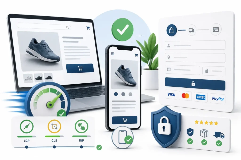
Google’s Core Web Vitals give you three measurable targets: Largest Contentful Paint (LCP) under 2.5 seconds, Cumulative Layout Shift (CLS) under 0.1, and Interaction to Next Paint (INP) under 200 milliseconds. Run your store through Google PageSpeed Insights β€” it shows exactly which elements are causing delays and ranks them by impact.
The highest-impact fixes for most stores: convert product images to WebP format, defer non-critical JavaScript from loading on the initial page view, and switch to a faster hosting plan if your server response time is above 200ms. These three changes alone often cut LCP by a full second.

[ Strategy 2 ]

Design for Mobile Shoppers, Not Desktop

Over 60% of ecommerce traffic comes from mobile devices, but mobile converts at roughly half the rate of desktop (Monetate, 2024). The gap isn’t because mobile shoppers are less serious. It’s because most ecommerce sites are built on desktop and patched for mobile β€” and buyers feel it.

The specific issues that kill mobile conversion: tap targets too small to press accurately, product images that require pinching to read, checkout forms with tiny text inputs, and “Add to Cart” buttons that disappear when the buyer scrolls down the product page.
Test your actual checkout on a physical phone β€” not Chrome DevTools. The difference in what you notice is significant. A sticky “Add to Cart” button on mobile product pages alone can lift mobile conversion by 5–10% on sites that don’t already have one.

[ Strategy 3 ]

Place Trust Signals Where Hesitation Happens

Trust badges placed at the footer of a page don’t help a buyer who is hesitating on the product page. Trust signals work when they’re positioned at the exact point where doubt enters.
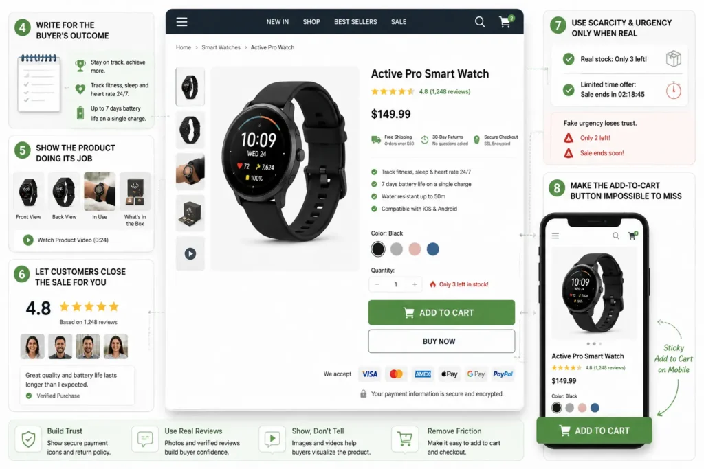
On product pages, show your return policy, secure payment icons, and customer review rating above the fold β€” before the buyer has to scroll. On the checkout page itself, show the SSL security badge, accepted payment methods, and your delivery promise on the same screen as the payment fields.
The return policy is the most overlooked trust signal in ecommerce. A clearly visible “30-day returns, no questions asked” removes one of the most common reasons buyers hesitate on a purchase they actually want to make.

Product Pages That Sell

Product Pages That Remove the Reason Not to Buy
Product Remove Reason

The product page is where most buying decisions are made or abandoned. Not at checkout β€” there. Buyers who reach checkout with a clear picture of what they’re getting, why it’s right for them, and confidence in the seller convert at a significantly higher rate than buyers who arrive at checkout with unresolved questions.

[ Strategy 4 ]

Write for the Buyer’s Outcome, Not the Product’s Specs

Most product descriptions are spec sheets. They list dimensions, materials, weight, and SKU numbers β€” information the buyer may need eventually, but not the information that creates purchase intent.

“2.5L capacity” answers a specification question. “Brews enough for four cups in one go β€” no refilling mid-morning” answers a buyer’s actual concern. The outcome-first format doesn’t hide the spec β€” it leads with why the spec matters to the person reading it.
The structure that works: open with the specific problem or scenario the product addresses, follow with the outcome the buyer gets, then support it with the technical spec. This order matches how buyers actually evaluate a purchase.

[ Strategy 5 ]

Show the Product Doing Its Job

A product image on a white background answers “what does it look like.” A lifestyle image answers “what does it look like when I use it.” Buyers need both, but most ecommerce stores provide only the first.

Add at minimum: a front shot, a back or alternate-angle shot, one scale reference (product next to something familiar), and one in-use or context image. For apparel, show all available colours. For physical goods, show what’s included in the box.
If you have the option to add a 15–30 second product video, do it. Even a basic clip of the product in use β€” not a polished production β€” increases purchase intent by giving buyers the visual confirmation that a static image can’t provide.

[ Strategy 6 ]

Let Your Customers Close the Sale for You

A buyer who is uncertain about a purchase will look for social proof before deciding. If your reviews section is at the bottom of a long product page, they may not get there β€” and they’ll leave instead.

Move the star rating and review count directly under the product title, visible without scrolling on desktop. Reviews with photos and “Verified Purchase” labels carry more weight than text-only reviews. Don’t hide the negative reviews β€” responding to them publicly builds more trust than a wall of five-star ratings with no critical feedback.
For products with fewer than 10 reviews, the absence of social proof is itself a signal. Prioritise gathering authentic reviews on your lowest-review, high-traffic products before working on anything else in this section.

[ Strategy 7 ]

Use Scarcity and Urgency Only When They’re Real

Countdown timers that reset every time a visitor refreshes the page, and “Only 2 left!” notices on products that are always in stock β€” buyers notice these. Once they do, they stop trusting everything else on your site.

Real low-stock indicators work. When a product genuinely has three units remaining, showing that number creates legitimate urgency. Real time-limited offers work. A flash sale tied to a specific date, a pre-order window, or a seasonal promotion with an honest end date gives buyers a real reason to act now.
The rule is simple: only show urgency signals you can back up. One caught fabrication does more damage to conversion than removing all urgency signals entirely.

[ Strategy 8 ]

Make the Add-to-Cart Button Impossible to Miss

The “Add to Cart” button should be the most visually prominent element on the product page. It is, on most well-performing stores. On many stores it isn’t β€” it’s the same visual weight as the product title, the price, and the size selector.
Button colour should contrast against the page background by a minimum 3:1 ratio. Button text should state the action clearly β€” “Add to Cart” outperforms “Buy Now” for considered purchases; “Buy Now” outperforms “Add to Cart” for impulse or single-product stores. Test both.
On mobile, the button should be sticky β€” fixed to the bottom of the screen as the buyer scrolls through the product description. Removing the step of scrolling back up to find the button removes a small but real source of friction at the highest-intent moment of the page.

Checkout Optimisation

Checkout Is Where Most Conversions Die
Checkout Optimisation

Baymard Institute research puts average cart abandonment at 70.19% across industries. Checkout-specific issues β€” unexpected costs, mandatory account creation, and excessive form fields β€” account for the majority of those abandonments. The buyer has already decided they want the product. What follows is a set of friction points between that decision and a completed purchase.

[ Strategy 9 ]

Let People Buy Without Creating an Account

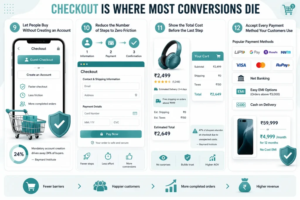
Mandatory account creation before checkout drives away 24% of buyers, according to Baymard Institute’s large-scale checkout research. For a store doing 100 orders a week, that’s 24 sales per week lost to a single, removable barrier.

The fix is straightforward: always offer guest checkout as the primary or equal option. Place it before the account creation prompt, not after. If you want to convert guest buyers into account holders, prompt them after the purchase confirmation β€” at that point, they’ve already had a positive transaction with you, and the account creation feels like a benefit rather than a toll.

[ Strategy 10 ]

Reduce the Number of Steps to Zero Friction

The average checkout across major ecommerce retailers requires 5.1 steps for guest checkout (Baymard Institute). A well-optimised checkout can achieve this in three: contact and shipping information β†’ payment details β†’ confirmation. Every step removed is a drop-off point eliminated.

Single-page checkout layouts β€” where all fields are visible on one screen β€” reduce perceived effort even when the field count is the same as a multi-step flow. The buyer can see they’re nearly done from the moment they start. That visibility matters.
Audit your checkout for unnecessary fields. Post code lookup tools that auto-fill city and state, address autocomplete, and removing “Company Name” unless your business model requires it β€” each reduces the time and effort between decision and purchase.

[ Strategy 11 ]

Show the Total Cost Before the Last Step

47% of shoppers who abandon at checkout cite unexpected costs as the reason β€” primarily shipping fees and taxes that only appear on the payment screen (Baymard Institute). The buyer had mentally committed to a price on the product page. The checkout reveals a higher number. They leave.

Show estimated shipping cost on the product page, not just in the cart or at checkout. If you offer free shipping above a threshold, display that threshold directly on the product page (“Free shipping on orders above β‚Ή999”). This framing also increases average order value β€” buyers who are close to the threshold will often add an item to reach it.
For stores with complex tax situations, showing “Taxes calculated at checkout” is acceptable, but keeping that amount as small and unsurprising as possible matters.

[ Strategy 12 ]

Accept Every Payment Method Your Customers Use

Every time a buyer reaches your payment screen and doesn’t see their preferred payment method, you’ve created a no-sale scenario that had nothing to do with your product or price.
For Indian ecommerce stores, the baseline payment stack should include UPI (Google Pay, PhonePe, Paytm), debit and credit cards, net banking, EMI options for orders above β‚Ή3,000, and cash on delivery for markets where trust in online payments remains a barrier. Each additional payment method covers a segment of buyers who would otherwise abandon.
For high-ticket items, displaying the monthly EMI amount prominently on the product page β€” not just at checkout β€” removes the price objection before it forms. “β‚Ή5,999 or β‚Ή499/month for 12 months” is a meaningfully different frame for a buyer evaluating affordability.

Cart Recovery

Win Back the 70% Who Left Without Buying
Cart Recovery

Even a well-optimised store loses buyers. Some were browsing, some were interrupted, some had a genuine hesitation they didn’t resolve. Recovery strategies capture a portion of that lost intent β€” from buyers who were genuinely close to purchasing and just needed one more moment or reason to complete it.

[ Strategy 13 ]

Set Up a Cart Abandonment Email Sequence

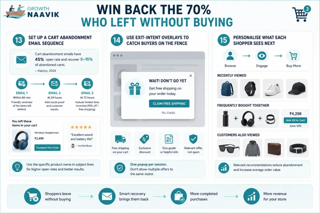
Cart abandonment emails have an average open rate of 45% and a recovery rate of 5–15% of abandoned carts, depending on product category and email quality (Klaviyo, 2024). For most stores, this is a revenue channel sitting completely inactive.

A three-email sequence covers the full recovery window. Email 1: send within 60 minutes of abandonment β€” a simple reminder showing the specific product the buyer left behind, no discount. Email 2: send at 24 hours β€” add social proof, a review or a customer result relevant to the product. Email 3: send at 72 hours β€” optionally include a limited-time incentive (10% off, free shipping) if the margin allows.
Subject lines with the specific product name consistently outperform generic copy like “You left something behind.” The buyer knows what they left. Name it.

[ Strategy 14 ]

Use Exit-Intent Overlays to Catch Buyers on the Fence

Exit-intent overlays trigger when a desktop user moves their cursor toward the browser bar β€” the signal that they’re about to navigate away. On mobile, they trigger on the back-button gesture. Used carefully, they catch buyers who were close to purchasing and needed one more prompt.

The offer matters. Free shipping on the current cart, a percentage discount, or a size guide that removes a specific hesitation (common for apparel) all work better than a generic newsletter signup. The offer should be directly relevant to what the buyer was looking at.
One rule: one popup per session. If you’ve already shown a welcome discount overlay when the buyer arrived, skip the exit-intent overlay. A buyer who sees two popups in one session doesn’t feel valued β€” they feel chased.

[ Strategy 15 ]

Personalise What Each Shopper Sees Next

Buyers who don’t purchase on their first visit often come back. What they see when they return β€” and what they see during their current visit on category and cart pages β€” affects whether they buy or browse again.

Basic personalisation doesn’t require custom development. “Recently Viewed” widgets, “Frequently Bought Together” recommendations, and “Customers Also Viewed” modules are available natively in Shopify and most WooCommerce setups. These keep the buyer engaged with relevant products instead of hitting a dead end after viewing one item.
Product recommendation widgets placed near the cart page serve two purposes: they reduce abandonment by giving the buyer something else to consider, and they increase average order value when the buyer adds a recommended product before completing checkout.

where to start

Where to Start If You're Doing This for the First Time
Where to Start
Fifteen strategies is a lot. Trying to implement all of them at once produces partial changes across every area and meaningful improvement in none.
The practical starting point is a quick audit across three questions.
First: what does your Google Analytics 4 data show about where buyers are dropping off? If you see high exit rates on product pages, start with Strategies 4–8. If exit rates are concentrated in the checkout flow, start with Strategies 9–12. If you have no data yet, set up GA4 event tracking for Add-to-Cart, Checkout Started, and Purchase before doing anything else β€” without that, you’re optimising blind.
Second: what are the three easiest changes you can make this week? Guest checkout, an honest shipping cost on the product page, and a cart abandonment email sequence are all achievable in under a day on most platforms. The impact is measurable within two to four weeks.
Third: what can you test? CRO compounds when you measure the effect of each change and use that data to inform the next one. A store that makes five measured changes over six months consistently outperforms a store that redesigns everything at once with no baseline to compare against.
Once you’ve covered the high-impact basics, the next question most stores run into is how their conversion benchmarks compare to others in their category β€” and which metrics actually indicate a CRO problem versus a traffic quality problem.

Faqs

Frequently Asked Questions

The global average ecommerce conversion rate is 1.4%. A rate of 2–3% is considered above average for most product categories. Top-performing stores in competitive niches reach 3–5%. What counts as "good" varies significantly by industry, price point, and traffic source β€” a luxury goods store converting at 0.8% may be outperforming its category, while a fast-fashion store at 2% may be underperforming.

Low conversion rates typically trace back to one of four areas: slow page load times driving buyers away before they see the product, product pages that don't answer the buyer's actual questions, a checkout flow with friction points (unexpected costs, mandatory account creation, too many steps), or a mismatch between the traffic arriving and the products being sold. Identifying which area is causing the drop requires looking at where in the funnel buyers are exiting β€” not just the overall conversion percentage.

Product page design determines whether a buyer gets the information and confidence they need to make a purchase decision. Specific elements with measurable impact include the position of the Add-to-Cart button, the quality and type of product images, the format of the product description, the visibility of the review rating, and the placement of trust signals like return policy and payment security badges. A product page that answers every likely buyer question before they have to ask it converts significantly better than one that lists specs and stops there.

The three highest-impact checkout changes, based on Baymard Institute research: offering guest checkout (reduces abandonment by up to 24%), showing all costs including shipping before the final payment step (addresses 47% of abandonment reasons), and reducing the number of checkout steps to three or fewer. These three changes alone cover the majority of avoidable checkout abandonment for most stores.

Reducing cart abandonment requires fixing the reasons it happens β€” primarily unexpected costs, required account creation, and overly long checkout flows. Once on-site friction is addressed, a three-email cart abandonment sequence (sent at 1 hour, 24 hours, and 72 hours after abandonment) recovers a portion of buyers who left for reasons unrelated to the product or price. Exit-intent overlays with a relevant offer can also capture buyers at the moment they're about to navigate away.

Yes, directly and measurably. Each one-second delay in page load time reduces conversions by approximately 7%. A page that takes three seconds to load loses around 40% of visitors before they see any content. For ecommerce stores, the product page and checkout page load speeds are the most conversion-critical. Google's PageSpeed Insights tool provides a free site-specific audit with prioritised recommendations.

Changes that remove specific friction points β€” guest checkout, upfront shipping costs, a faster page load time β€” typically show measurable impact within two to four weeks, once enough transactions have occurred to produce statistically reliable data. Structural changes like product page redesigns or a checkout flow overhaul take four to eight weeks to show reliable results. Cart abandonment email sequences show results within days of launch. CRO is not a single-event improvement β€” it compounds over time as each change provides a new, higher baseline to improve from.

Aanal Panchal

eCommerce SEO & PPC Specialist

Aanal Panchal is an eCommerce SEO & PPC Specialist with expertise in helping online brands increase visibility, drive qualified traffic, and improve revenue through strategic organic and paid marketing campaigns. Aanal specializes in optimizing eCommerce websites and marketplace listings to improve search rankings, maximize advertising ROI, and enhance the customer buying journey. Aanal develops scalable strategies that help businesses generate sustainable traffic, increase conversions, and grow sales.